Whoops – pardon the NDA’S
Some of my best, shiniest work is squirreled away forever, you know how it is! This is just a sample of work I’m able to show. I guess the rest was just too damn cool…
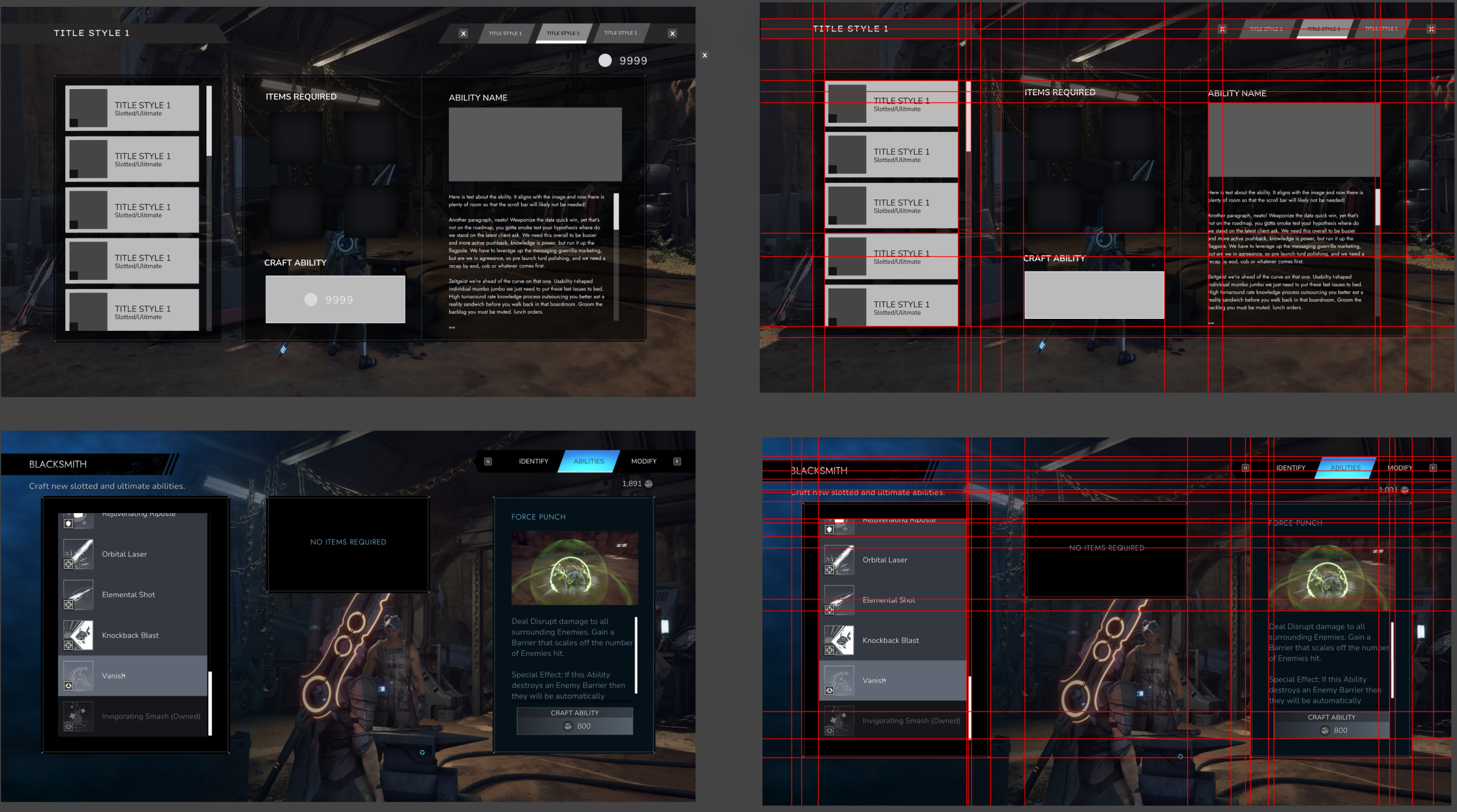
EMPYREAL: UX REVIEW
Two week project to review visual consistancy and User Experience
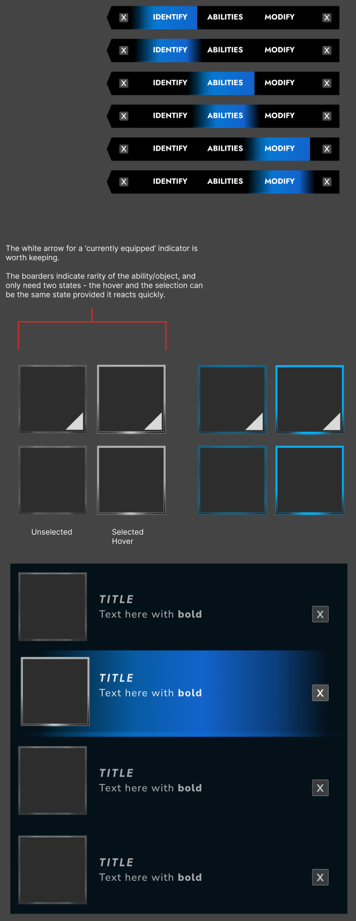
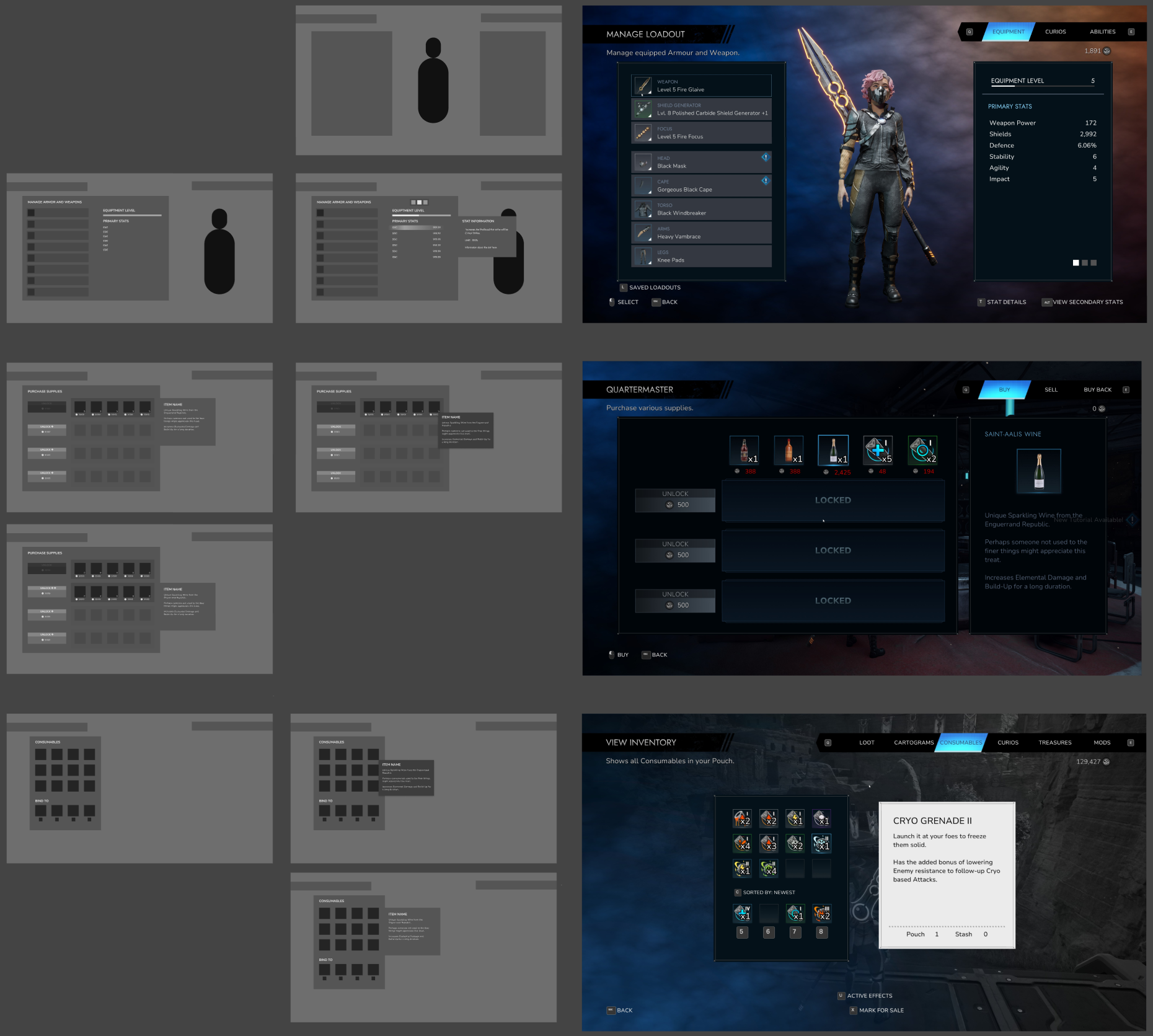
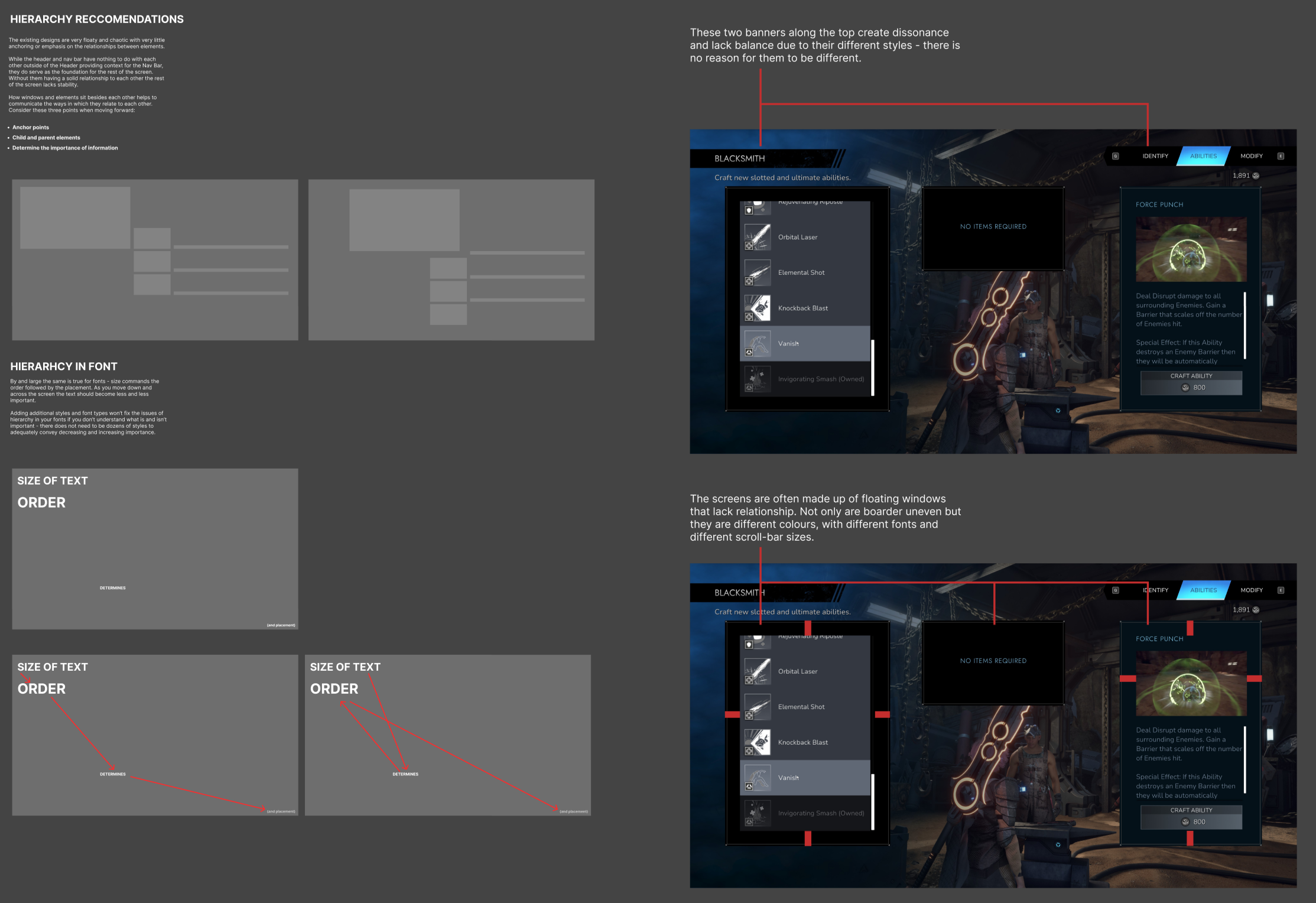
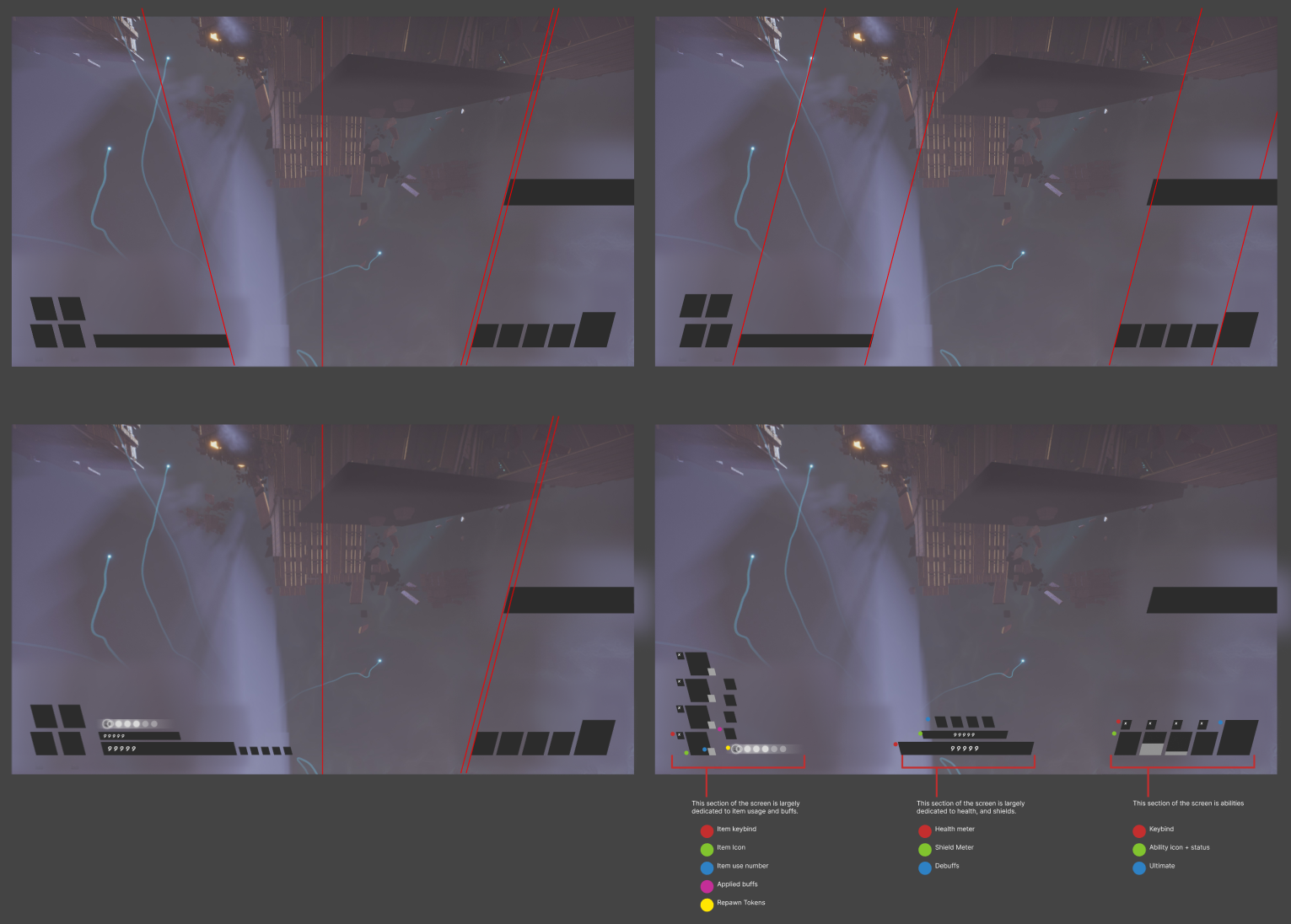
This was an incredbily short and rewarding project, leveraging my UX skills and discernment to identify problem areas, quick wins, and help the team move forward themselves.
WITH A FEW MONTHS UNTIL RELEASE, THE TEAM KNEW THEY HAD CONSISTENCY ISSUES – THEY ALREADY KNEW THE SCOPE OF THE PROBLEMS WERE TOO GREAT TO COMPLETE FOR RELEASE.